Case Study
Azure Airlines
A hypothetical airline case study focused on redefining the passenger booking experience with intuitive, serene, and user-centered design

Client
UX Design institute
Project Year
Dec. 2023 – Oct. 2024
UI Mentor
Mustafa Al Alawad
My Role
UX Design
Project Tool:


Project Context
While airlines are committed to providing exceptional in-flight experiences, the same often can’t be said about the ‘journey before the journey’—the online booking process.
Poor digital experiences not only negatively impact users’ emotional and psychological state, but also shapes how they perceive and feel about the brand.
So, in light of these issues, I chose to design a hypothetical, user-centered booking experience for a new South American airline. My goal was to identify and resolve common pain points from the outset, creating an experience that anticipates users needs and simplifies each step of the journey.
Use case: Booking a budget-friendly, round trip flight with baggage. This scenario reflects a common airline booking need, where comparing prices across dates is essential for budget conscious travelers/
Research
"No research without action,
– Kurt Lewin
Competitive Benchmarking
In a competitive landscape, analyzing competitors is crucial to identifying conventions, innovations, and opportunities for improvement. For this first phase of research, I conducted a competitive analysis of four key players: Qatar Airways and Singapore Airlines (ranked as the top two airlines by SKYTRAX in 2023), the low-cost carrier Ryanair, and a search aggregator SkyScanner
Key Findings
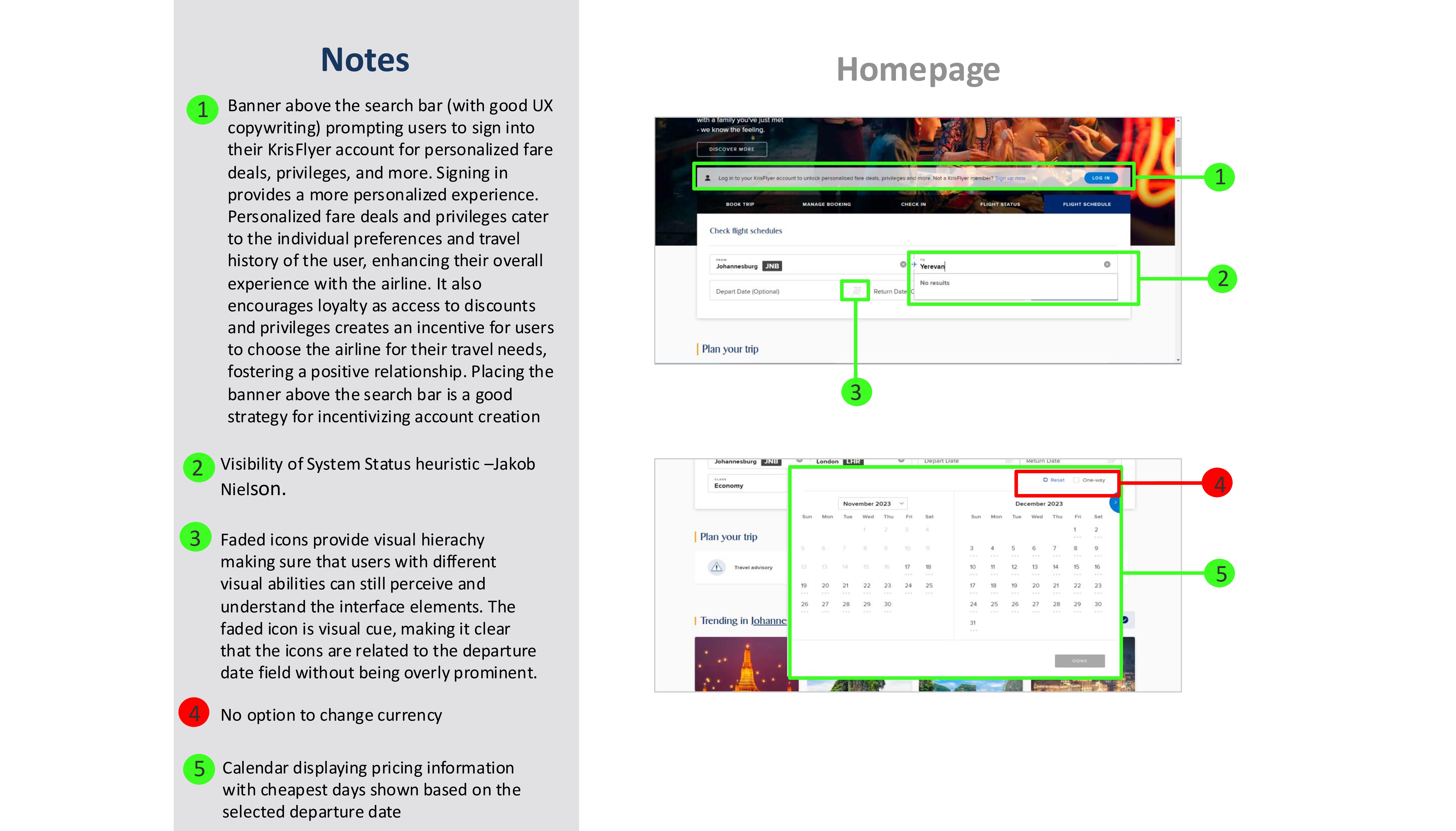
1. Smart Personalisation
Competitors effectively tailor the user experience by automatically detecting and and setting the user’s location in critical areas, such as the flight search engine and flight offerings.
This feature not only saves time by removing the need for manual input but also reinforces a sense of recognition and relevance, enhancing the overall user experience.
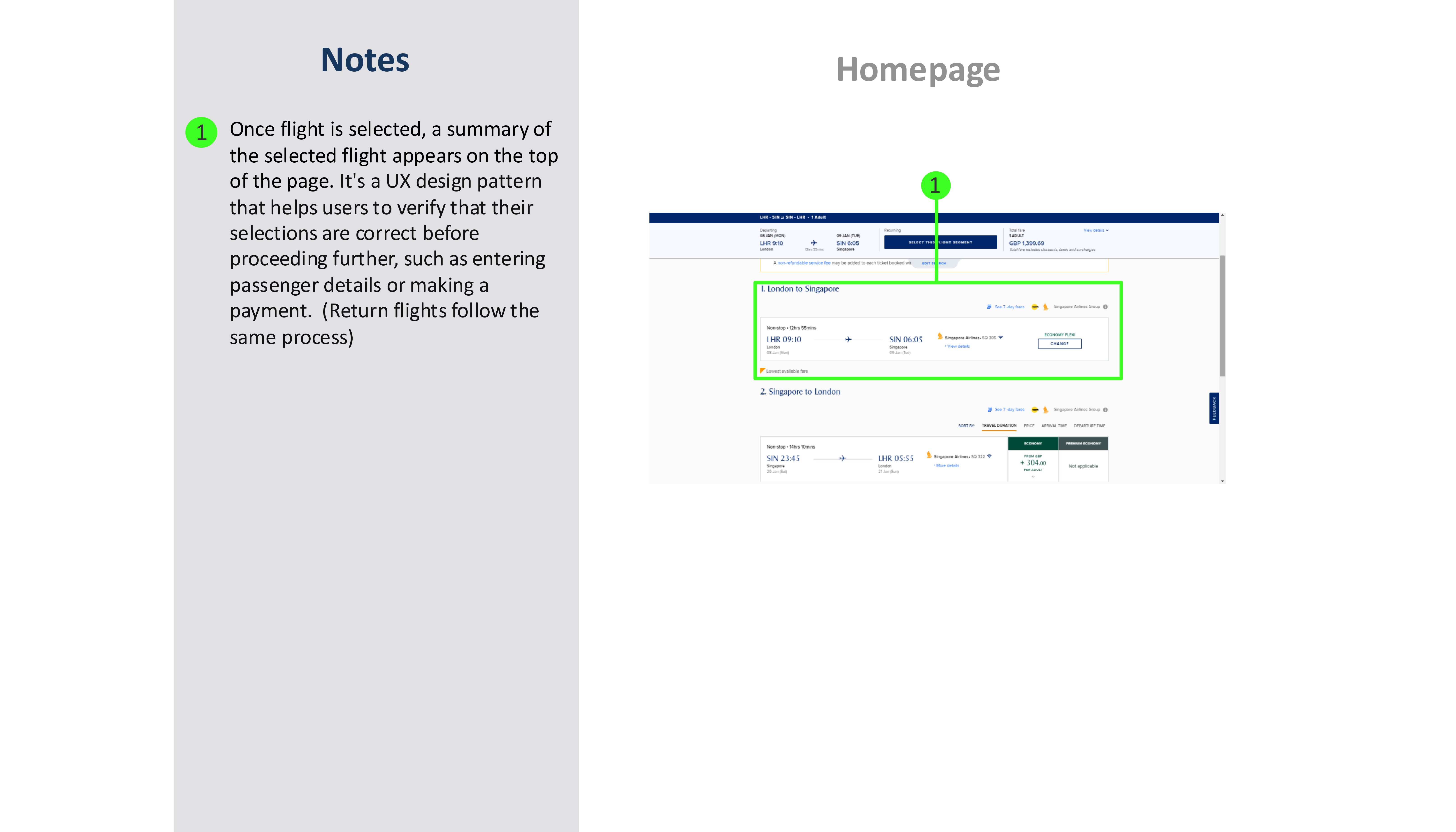
2. Progressive Disclosure
Competitors demonstrate effective use of progressive disclosure ranging from small interactions to larger elements. For example, the “Add Promo Code” label on the flight search engine transforms into an inline edit field only when clicked. Or expandable flight search details on search results page allows users to access more specific information, like baggage allowance or layover duration, only when needed.
This approach reduces cognitive load, maintains a clean interface, and allows users to focus on their immediate tasks.
3. User Control and Freedom
Competitors excel in empowering users with tools that enhance flexibility and control, aligning with Jakob Nielsen’s “User Control and Freedom” heuristic.
For example, a price comparison bar on flight results pages enables users to quickly compare nearby dates and prices without navigating away from the page. Similarly, an inline editable search bar allows users to adjust search parameters directly, offering the flexibility to correct mistakes or refine searches seamlessly without interruptions.
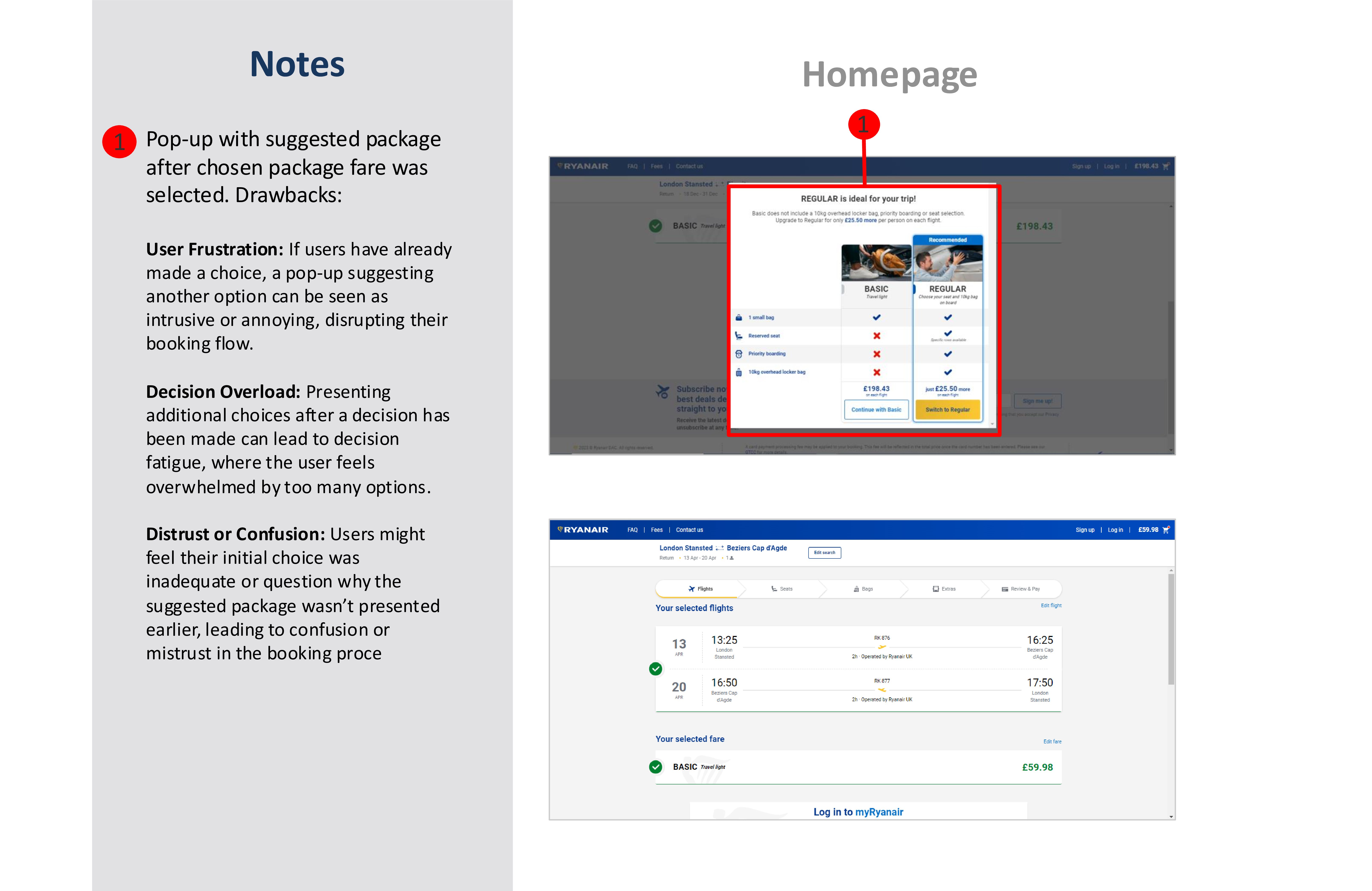

4. Interface Clutter
A competitor struggles with excessive visual clutters, including competing colors and overlapping elements, which overwhelms users making it challenging to focus on key tasks
In contrast, another competitor demonstrates how a minimalist design can enhance usability by focusing on essential features and avoiding unnecessary distractions.
Keeping a clean interface and emphasising key actions helps reduce cognitive load and supports a seamless booking process
5. Unclear Heirachy
A competitor fails to prioritise clear heirachy and clear labeling. Important features such as “My Bookings” and travel updates, are buriad under a myriad of banners and located at the bottom of the home page -making it difficult to locate.
Conversely, competing airlines demonstrate the importance of vlear visual heiracy. Their interface prioritises essential features, ensuring they are easy to locate and navigate. Ultimately, this reduces cognitive load, supports intuitive interaction and enhances user satisfaction
6. Transparency and Trust
A competitor impedes and undermines user trust by lack of transparency or poorly placed key informations. Additional fees, such as baggage allowances, are disclosed late in the booking process, frustrating users and creating a sense of being misled. Disclaimers, like card processing fees, are buried at the bottom of the homepage, and pricing details for fare inclusions, such as baggage allowances, are not prominently displayed. This lack of clarity leaves users uncertain about what is included and increases the likelihood of overlooking important details.
Conversely, other competitor airlines excel by providing transparent and upfront information about travel costs and features. This approach fosters trust by ensuring users have all necessary details early in the process, supporting better decision-making.
Online Survey
The next research tool used was an online survey, which included a total of 10 participants and collected both qualitative and quantitative data. The survey questions were carefully structured to align with research best practices. Qualitative questions were open-ended, allowing participants the freedom to provide responses that best reflected their perspectives without being constrained by potentially leading responses. For example, a question such as, “How positively did you feel about this product?” is leading and primes users to answer based on an assumption of a positive experience. Questions like this were avoided to allow for more accurate and insightful insights into the users’ behaviours, goals and experiences
Key Findings
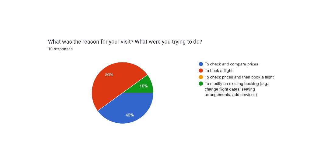
1. Reason for Visiting Airline Site
- 50% of participants reported their last visit was to book a flight.
- 40% visited to check and compare prices.
- 10% visited to modify an existing booking (e.g., change flight dates, seating arrangements, add services).
These insights highlight the importance of enhancing the booking experience and simplifying price comparison features, as these are the two most common user goals when visiting airline websites.
2. Task Completion
- 100% of participants reported being able to complete their task on the airline website.
3. Frustions and Suggestions
- Price Transparency and Comparison: Respondents highlighted the need for improved price comparison tools for both flexible and fixed travel dates, as well as greater transparency around additional costs like baggage fees.
- Search and Navigation: Some participants suggested improving the search functionality for flights.
- Convenience Features: One user recommended easier check-in processes and more convenient payment options, such as Mastercard Tap to Pay and Visa Press.
No Feedback: Two participants stated they had no frustrations with their experience.
4. Booking Platform Preferences
- 80% of participants preferred booking flights via a website rather than a mobile app, emphasizing the importance of a well-designed, streamlined booking system for web users.
5. Airlines Highlighted
- Positive Experiences:
- Qatar Airways, Emirates, and FlySafair were praised for:
- Easy booking and checkout processes.
- Transparency in price comparisons.
- Promotions that enhanced user satisfaction.
- Negative Experiences:
- Egypt Air, Fast Jet, and others were criticized for:
- Hidden booking fees revealed late in the process.
- Issues with card payment processing.
- Lack of clarity about additional fees, such as those charged at the airport.
6. Key Airline Selection Factors
- Price: Mentioned by 100% of participants as a top factor.
- Flight Schedule and Duration: Includes convenient flight times, frequency, direct flights, and layover durations.
- Baggage Policy: Clarity and fairness of baggage allowances and fees.
- In-Flight Amenities: Ranked third in importance.
- Refund and Cancellation Policies and Safety Record: Ranked as the least influential factors.
Understanding user priorities like price, flight schedules, and baggage policies allows for the designing of a website that prioritises the placement of this information upfront – helping users quickly access the information that matters most to them. This not only simplifies the decision-making process but also builds trust by ensuring clarity and transparency throughout the booking experience.
Usability Test
“What people say. What people do. And what people say they do are often 3 entirely different things”
– Margarete Mead
This statement highlights the critical importance of observing behavior to gain meaningful insights. Memory can be fallible at best and unreliable at worst. To add to this, perception is often subjectivive, making direct observation one of the most reliable methods for gathering data. For the usability tests, I had two participants complete and navigate a series of tasks on two separate airlines: Egypt Air and Virgin Atlantic.

Key Insights
Users expressed a need for upfront and transparent communication regarding additional costs, such as baggage fees.
Users wanted the ability to compare flights based on factors like price, layover duration, and departure times to make informed decisions.
Clear instructions and better visual distinctions are essential for preventing errors. For example, participants were confused by pre-highlighted fare options that looked pre-selected.
Participants wanted features to compare flights directly within the search results, based on price, layover duration, and departure times.
Users highly valued the direct flight filter, especially for shorter trips, to minimize travel time
Participants expressed a need for step-by-step assistance, such as highlighting the next required action or guiding users through the booking process in an intuitive way.
Analysis
"If I had an hour to solve a problem and my life depended on the solution, I would spend the first 55 minutes
– Albert Einstein
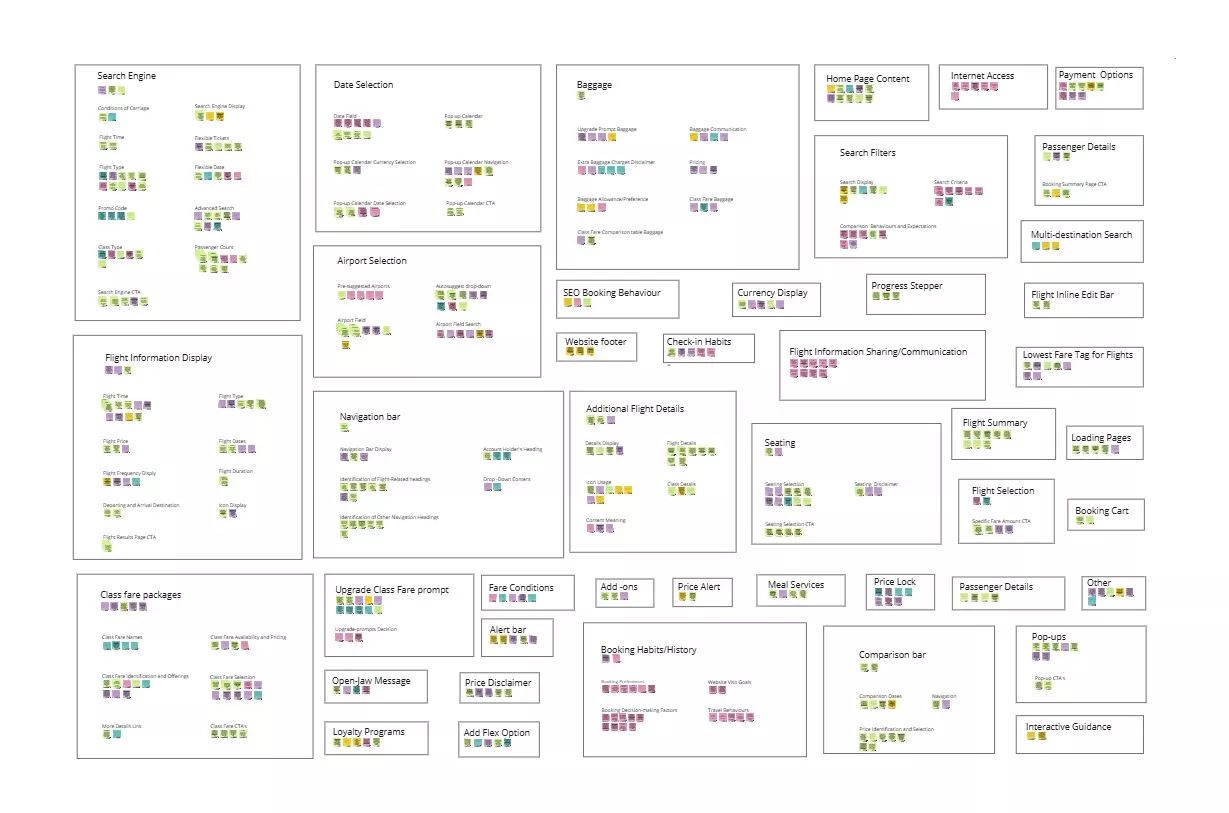
Affinity Diagram
To analye the data, the K-J method, also known as an affinity diagram, was used. Themes were derived and categorised into specific functions and elements of the airline website, such as search engine functionality, seating, class fare packages, price selection, and more. Broader categories, like baggage, were also established, alongside behavioral and contextual groupings, such as SEO booking behavior and booking habits/history.
This approach helps streamline the design process by making it quick and easy to refer to the affinity diagram for specific functionality, such as seating or the search engine, thanks to its clear and structured layout.

Customer Journey Map
This is where the rubber hits the road—the point where the beauty of research takes shape through analysis, offering a comprehensive view of the culmination of your findings. . This analytical technique provides a clear visual representation of the user’s emotional journey while interacting with a product, service or brand. In this case, its used to gain insight into the experiences of the airline booking process.
This customer journey map was divided into detailed steps to capture the positives, negatives, mental models, and other key insights.The map revealed fascinating insights. While there were many positive points, several stages contained pain points that outweighed the positives, resulting in a negative overall user experience.
This was particularly evident in a curve of gradual erosion of user satisfaction that began at the Search for Flights stage. This curve was punctuated by several sharp drops at specific stages, most notably at the View Class Packages stage, which represented the peak of frustration and the emotional low point for users.
")

Flow Diagram
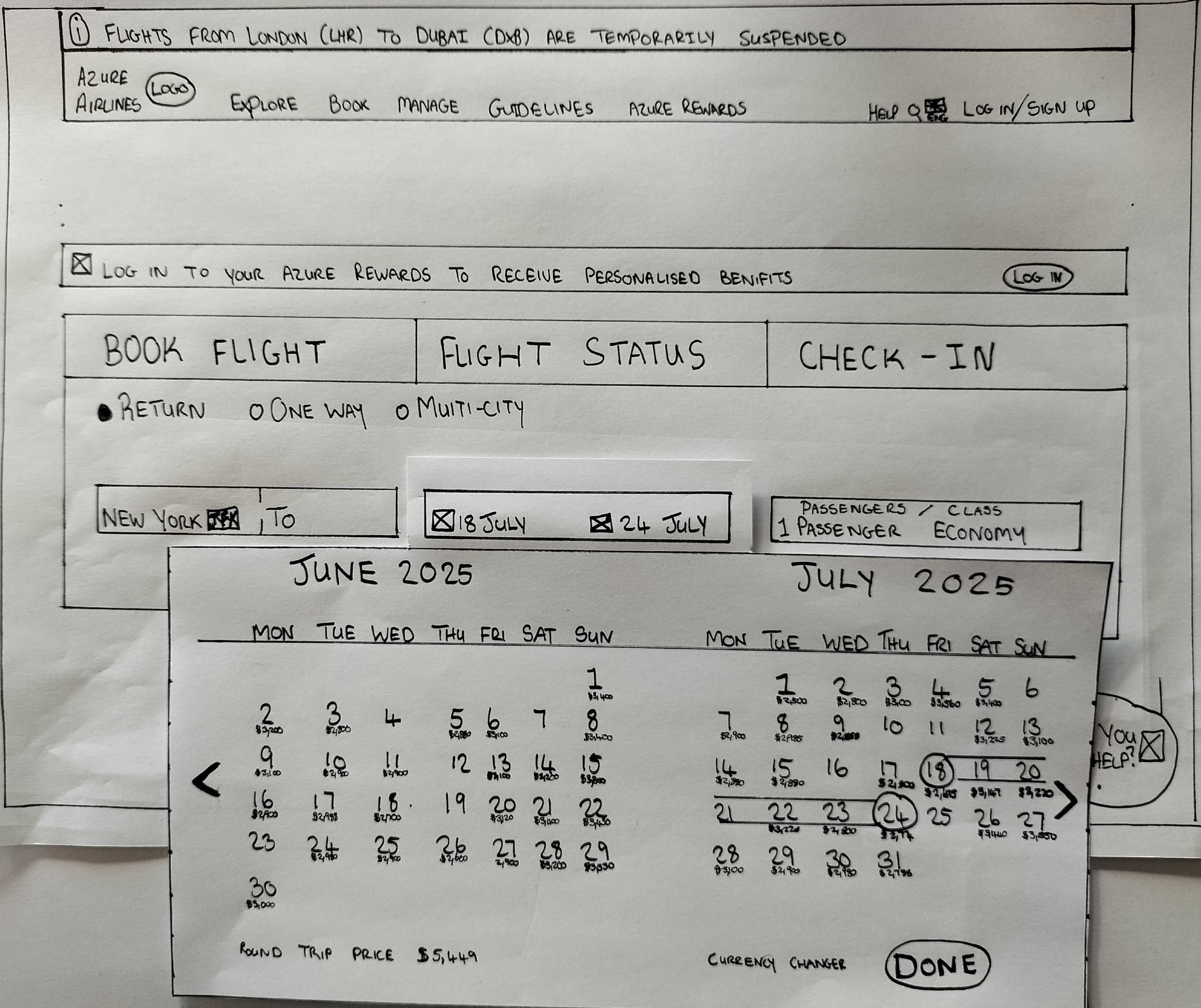
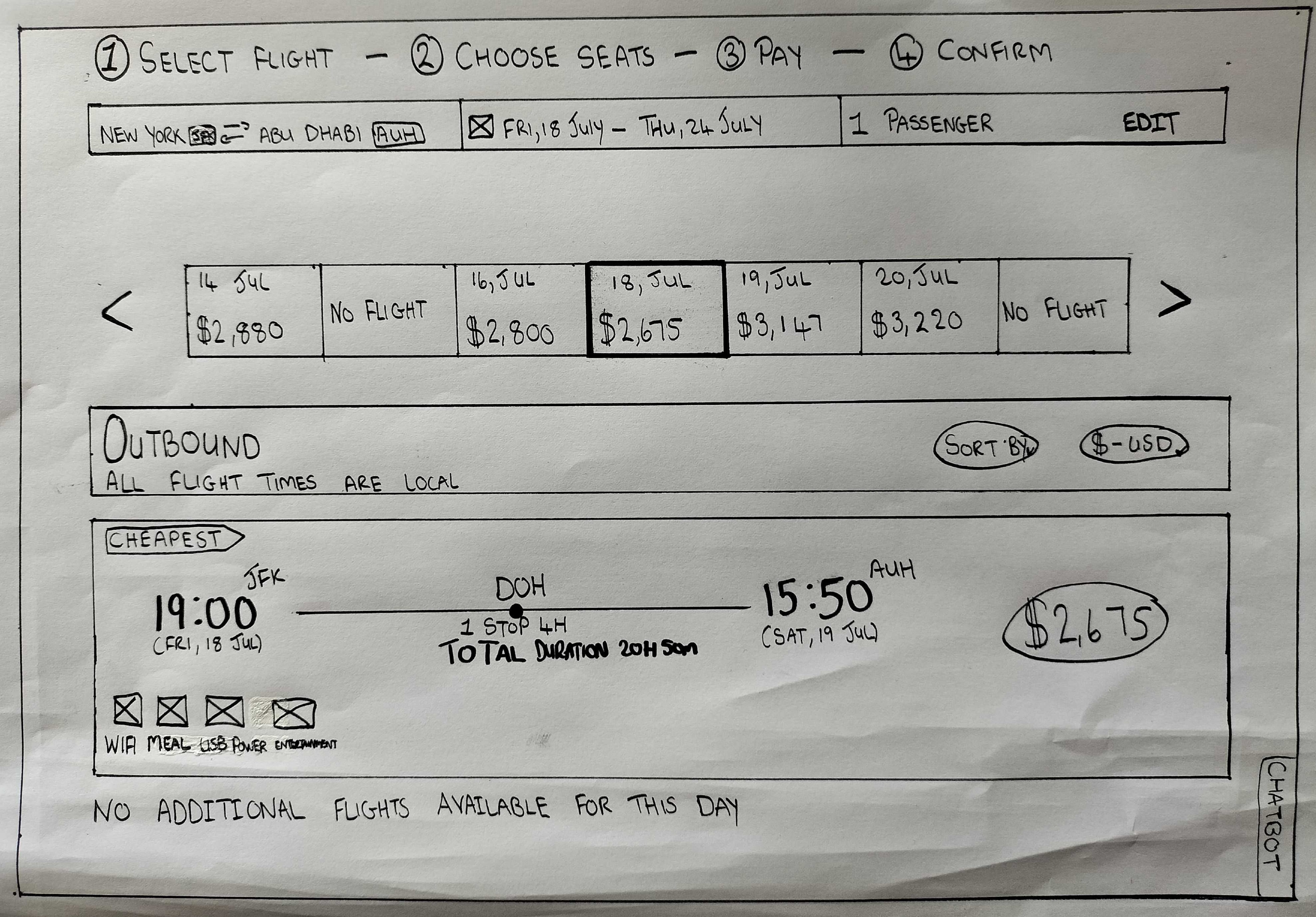
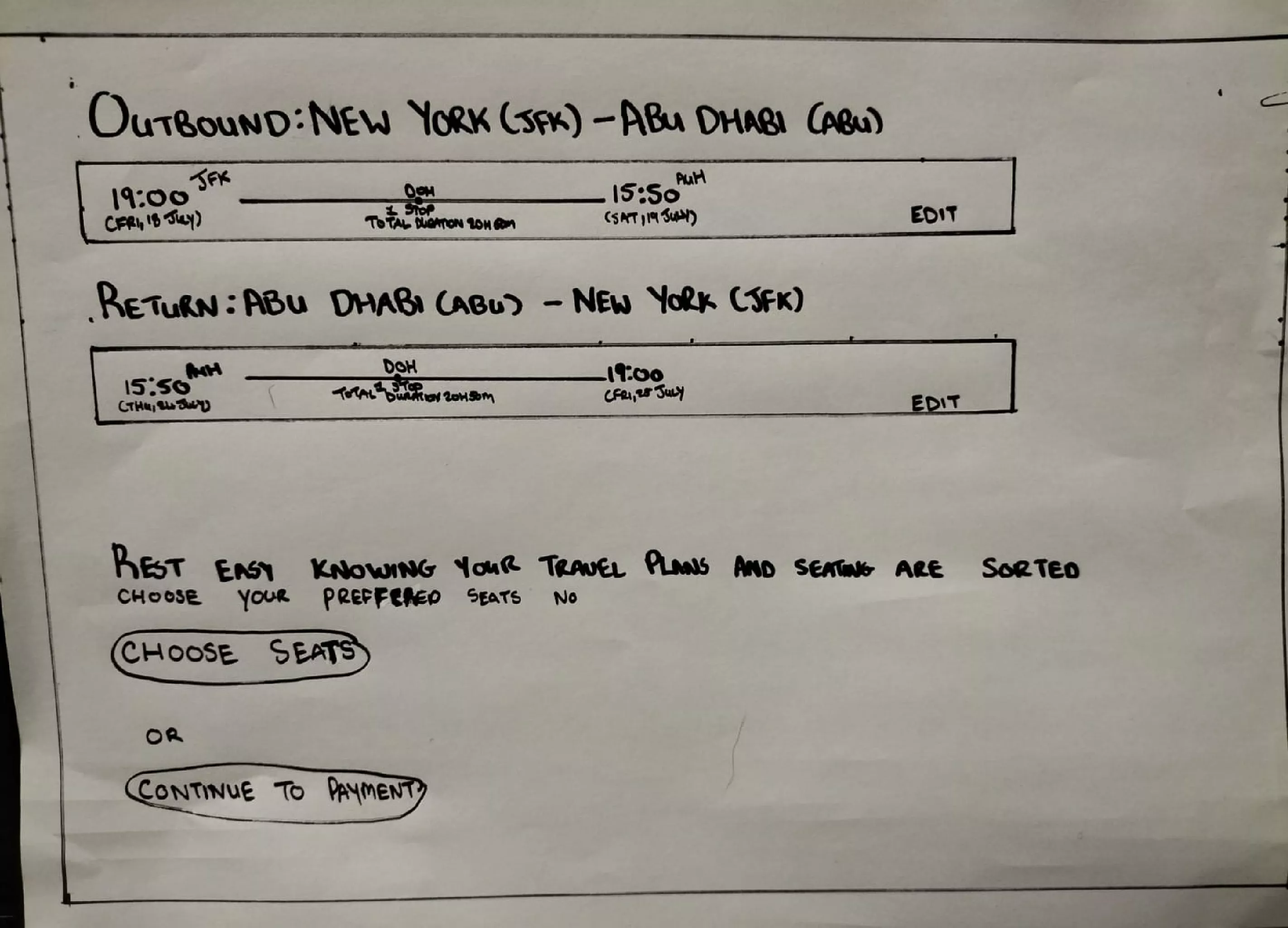
After analysing the research data, I set out to design a booking flow that was not only streamlined and efficient—reducing the steps required for users to complete their tasks—but also addressed key pain points identified during the analysis phase.
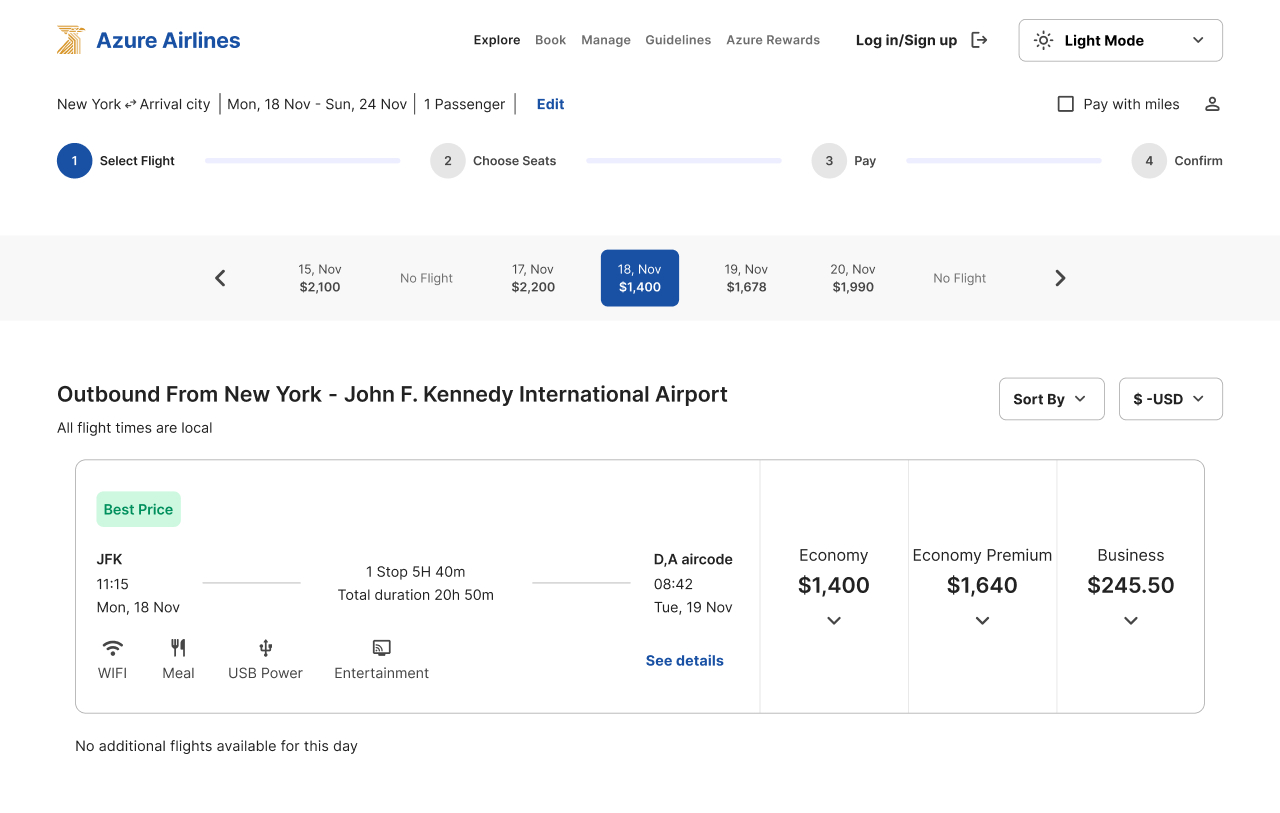
Smart defaults were introduced, such as auto-filling users’ locations and providing dynamic auto-fill suggestions, to reduce clicks and effort. Pre-selected options were also incorporated in alignment with the projects use-case: a budget-friendly 7-day round trip for two people with baggage.
Tip: Hover over the flow diagram to see flow problems that were addressed
A critical area of frustration, and the peak of emotional low point for users ,revolved around baggage – particularly the transparency of baggage allowance and costs.
Every competitor I have analysed so far had set their lowest class tier – a tier without baggage – as the default option. (Those who utilised pre-selected defaults). While this might seem logical at first, this design decision completely overlooks key psychological insights, particularly the principle of loss aversion.
This principle states that the pain of losing something is felt more strongly than the pleasure of gaining something of equal value. In the context of paying extra for baggage, the perception of an additional charge often feels more significant to users, creating a negative emotional response—an interaction and perception you don’t want your users to have towards your brand, product or site.
To mitigate this, I reframed how information is presented by setting the class fare package that includes baggage as the default pre-selected option. This approach minimizes the risk of users experiencing negative emotions towards the product. It also increases user satisfaction by anticipating their needs. For users who do not require baggage, switching to a lower tier would be perceived as a financial “win,” making them feel like they have ‘saved’ money, which leverages the principle of gain framing. This strategic choice not only aligns with understanding user behavior but also enhances the overall user experience by making them feel empowered rather than penalized.
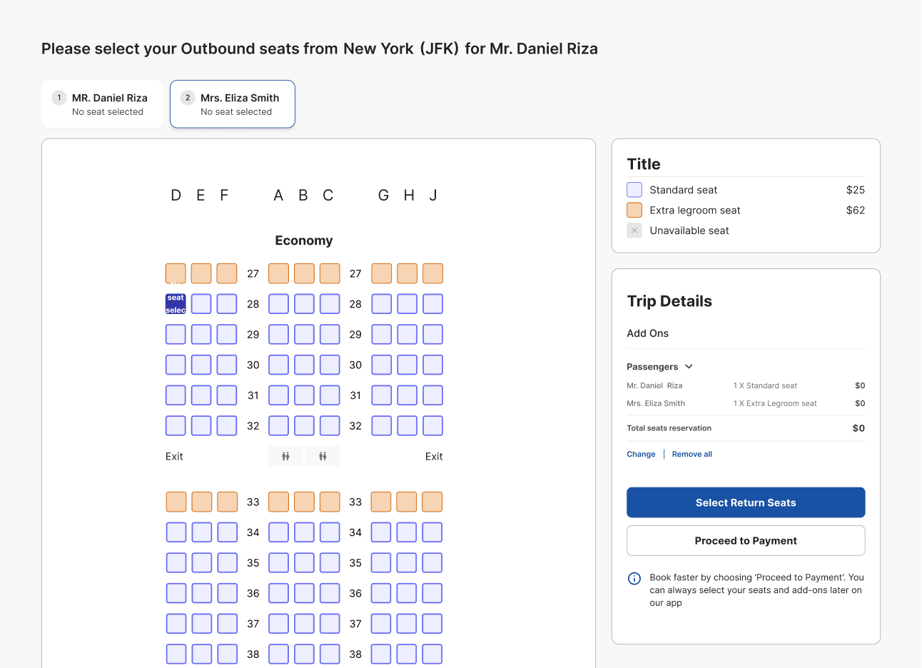
Interaction Design
The next step was to put pen (or pencil) to paper and see the designs come to life. This stage helped to visual what the end product might look like. The interaction design process took a lot of iterations. It was important to design a potential layout that was clear to understand, had visual heirachy, was clutter free and facilitated smooth interactions.


Design
“If we want users to like our software, we should design it to behave like a likeable person:
– Alan Cooper
Prototype
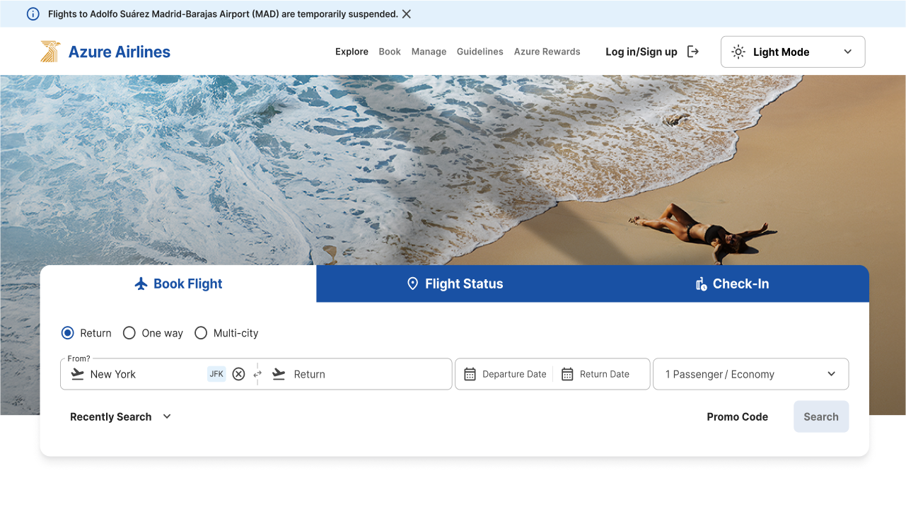
After completing a UI course, I worked on transforming my mid-fidelity designs into high-fidelity prototypes that closely resembled real-world functionality. My focus was on crafting designs that were not only aesthetically pleasing but also intuitive, user-centered, and scalable.
Curious to experience the booking process firsthand? Scroll down to try out my prototype.
Try my prototype to book your flight
Tip: Explore the prototype in dark mode if you prefer a different viewing experience. To view the prototype in full screen, use the expand button (the arrow icon next to the light and dark mode toggle).
Having trouble with the prototype or curious about detailed design rationale?
If the embedded prototype is slow or not loading, you can access the full Figma file directly here. To explore detailed comments on the design decisions, click the comments icon once opened (a small square icon on the left). Thank you for your understanding.
Copyright © 2024-Joy Designs Studio. All Right Reserved